LAST CUP CAFE

Aligning Business & User Goals Through User-Centric Redesign

A website redesign focused on enhancing usability and aligning the online experience with the community-driven brand.

A website redesign focused on enhancing usability and aligning the online experience with the community-driven brand.

A website redesign focused on enhancing usability and aligning the online experience with the community-driven brand.

YEAR

2024

DURATION

4 Weeks

Role

Sole UX/UI Designer

YEAR

2024

DURATION

4 Weeks

Role

Sole UX/UI Designer

THE PROBLEM

Customers struggle to find essential information on the Last Cup Cafe website due to poor usability and cluttered design, leading to frustration and missed opportunities to engage with the café’s brand and atmosphere

THE SOLUTION

A User-Centered Redesign That Makes Information Easy to Find—and the Café Easy to Love

BACKGROUND

Bridging the Gap Between Reputation and Online Experience

Despite being the #1 cafe in Rutland, VT, for three consecutive years, Last Cup Cafe’s online presence didn't live up to its reputation. Visitors to the site were met with an outdated design and frustrating navigation, making it hard for them to access key information like the menu, hours, and location.

Initially, I had assumed the business owners would prioritize an online ordering system. However, through research, I uncovered deeper usability issues that needed to be addressed first.

"For many consumers, the experience of visiting a café goes beyond just the coffee—it's about the atmosphere, the sense of community, and the ability to connect with others in a comfortable environment."

The Psychology of Coffee and the Café Experience," Journal of Consumer Research, 2022

The Psychology of Coffee and the Café Experience," Journal of Consumer Research, 2022

I set out to redesign the website to align it with the welcoming vibe of the café and improve its usability. This meant focusing on simplicity, ease of access to essential info, and ensuring the site felt just as inviting as stepping into the café itself.

THE SOLUTION

A User-Centered Redesign That Makes Information Easy to Find—and the Café Easy to Love

RESEARCH

A Deep Dive into Last Cup Cafe’s Existing Website

To better understand the current user experience, I conducted an audit of the existing Last Cup Cafe website. This allowed me to empathize with users while also offering a designer’s perspective, highlighting several key issues that needed attention:

  • Brand Alignment: The site feels more like a coffee roaster than a physical cafe, with minimal imagery and a lack of mission-focused content.

  • Navigation: Important information, like hours, menu, and location, are nonexistent or hard to find. The search function doesn’t work, and account creation lacks a clear purpose.

  • Functionality: The store link is broken, and the design feels outdated.

Current Last Cup Cafe Website

The current website struggles with brand alignment, navigation, and functionality, leading to a frustrating user experience.

RESEARCH

A Deep Dive into Last Cup Cafe’s Existing Website

To better understand the current user experience, I conducted an audit of the existing Last Cup Cafe website. This allowed me to empathize with users while also offering a designer’s perspective, highlighting several key issues that needed attention:

  • Brand Alignment: The site feels more like a coffee roaster than a café, with minimal imagery and a lack of mission-focused content, which may confuse users.

  • Navigation: Key info like hours, menu, and location is missing or hard to find. The search function is broken, and account creation is unclear, leading to frustration.

  • Functionality: No online ordering, out-of-stock store items, and an outdated design reduce usability and reliability.

To better understand the current user experience, I conducted an audit of the existing Last Cup Cafe website. Several key issues were identified:

  • Brand Alignment: The site feels more like a coffee roaster than a physical cafe, with minimal imagery and a lack of mission-focused content.

  • Navigation: Important information, like hours, menu, and location, are nonexistent or hard to find. The search function doesn’t work, and account creation lacks a clear purpose.

  • Functionality: The store link is broken, and the design feels outdated.

Current Last Cup Cafe Website

The current website falls short with brand alignment, navigation, and functionality, leading to a frustrating user experience.

Understanding Stakeholder Goals & User Needs

With a clear understanding of the existing user experience, I conducted a stakeholder interview, competitive analysis, and user interviews. As this was my first project with a real business, it was crucial to align the design with both the business goals and user expectations.

Stakeholder Interview: Hearing From the Business

I spoke to the stakeholder, Chris, to understand his needs and priorities for the website, ensuring the redesign aligned with his vision and goals.

I spoke to the stakeholder, Chris, to understand his needs and priorities for the website, ensuring the redesign aligned with his vision and goals.

I spoke to the stakeholder, Chris, to understand his needs and priorities for the website, ensuring the redesign aligned with his vision and goals.

Chris S

Owner of Last Cup Cafe

Key Insights:
  • Simplicity: Focus on showcasing the in-person experience, avoiding online ordering.

  • Community: Highlight the café’s welcoming vibe with an “About Us” page and photos.

  • Efficiency: Keep the site low-maintenance with static content due to time constraints.

Competitive Analysis: Benchmarking the Competition

I analyzed four local and industry-leading coffee shops, identifying strengths, weaknesses, and opportunities for design inspiration.

I analyzed four local and industry-leading coffee shops, identifying strengths, weaknesses, and opportunities for design inspiration.

La Cabra

Catalyst Coffee Bar

Ground Central

Starbucks

Strengths
  • Clear Navigation & User Flow

  • Visually Engaging & High-Quality Imagery

  • Community & Brand Connection

Weaknesses
  • Impersonal or Corporate Feel

  • Overemphasis on Design Over Functionality

  • Lack of In-Person Experience Representation

Opportunities
  • Replicating In-Person Experience Online

  • Personalization & User Engagement

  • Enhanced Mobile Optimization

Threats
  • Market Saturation

  • High User Expectations

  • Overcomplicated Design & Functionality

User Interviews: What Cafe Lovers Really Want

Through five in-depth interviews with frequent cafe-goers, I explored their needs, preferences, and frustrations when choosing and visiting cafes. I then analyzed my findings and created an affinity map to uncover key themes:

Through five in-depth interviews with frequent cafe-goers, I explored their needs, preferences, and frustrations when choosing and visiting cafes. I then analyzed my findings and created an affinity map to uncover key themes:

Understanding Stakeholder Goals & User Needs

With a clear understanding of the existing user experience, I conducted a stakeholder interview, competitive analysis, and user interviews. As this was my first project with a real business, it was crucial to align the design with both the business goals and user expectations.

Stakeholder Interview: Hearing From the Business

I spoke to the stakeholder, Chris, to understand his needs and priorities for the website, ensuring the redesign aligned with his vision and goals.

Chris S

Owner of Last Cup Cafe

Key Insights:

  • Simplicity: Focus on showcasing the in-person experience, avoiding online ordering.

  • Community: Highlight the café’s welcoming vibe with an “About Us” page and photos.

  • Efficiency: Keep the site low-maintenance with static content due to time constraints.

Competitive Analysis: Benchmarking the Competition

I analyzed four local and industry-leading coffee shops, identifying strengths, weaknesses, and opportunities for design inspiration.

La Cabra

Catalyst Coffee Bar

Ground Central

Starbucks

Strengths

  • Clear Navigation & User Flow

  • Visually Engaging & High-Quality Imagery

  • Community & Brand Connection

Weaknesses

  • Impersonal or Corporate Feel

  • Overemphasis on Design Over Functionality

  • Lack of In-Person Experience Representation

Opportunities

  • Replicating In-Person Experience Online

  • Personalization & User Engagement

  • Enhanced Mobile Optimization

Threats

  • Market Saturation

  • High User Expectations

  • Overcomplicated Design & Functionality

User Interviews: What Cafe Lovers Really Want

Through five in-depth interviews with frequent cafe-goers, I explored their needs, preferences, and frustrations when choosing and visiting cafes. I then analyzed the data and created an affinity map to uncover the key themes:

DEFINE

Bringing the User to Life

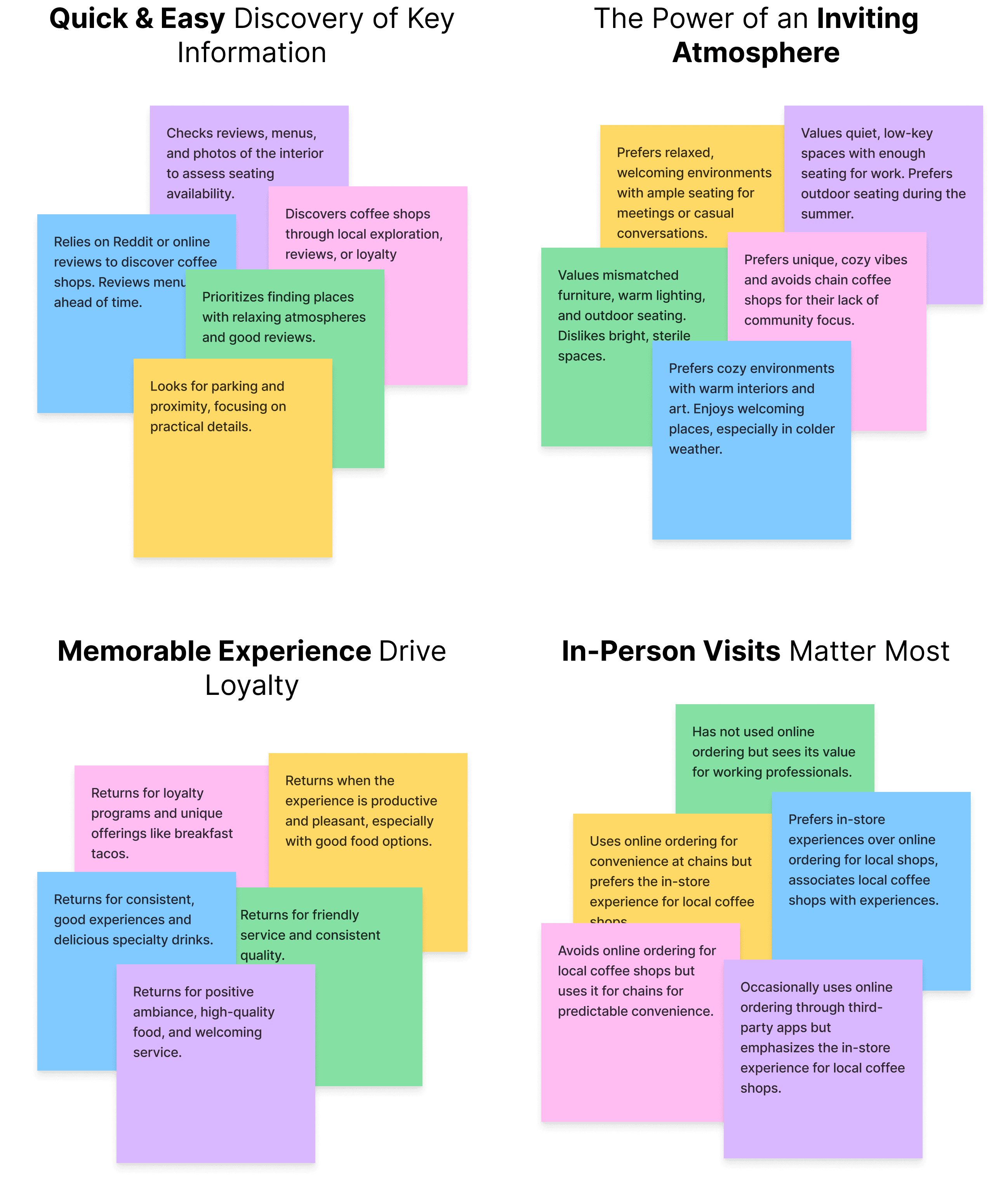
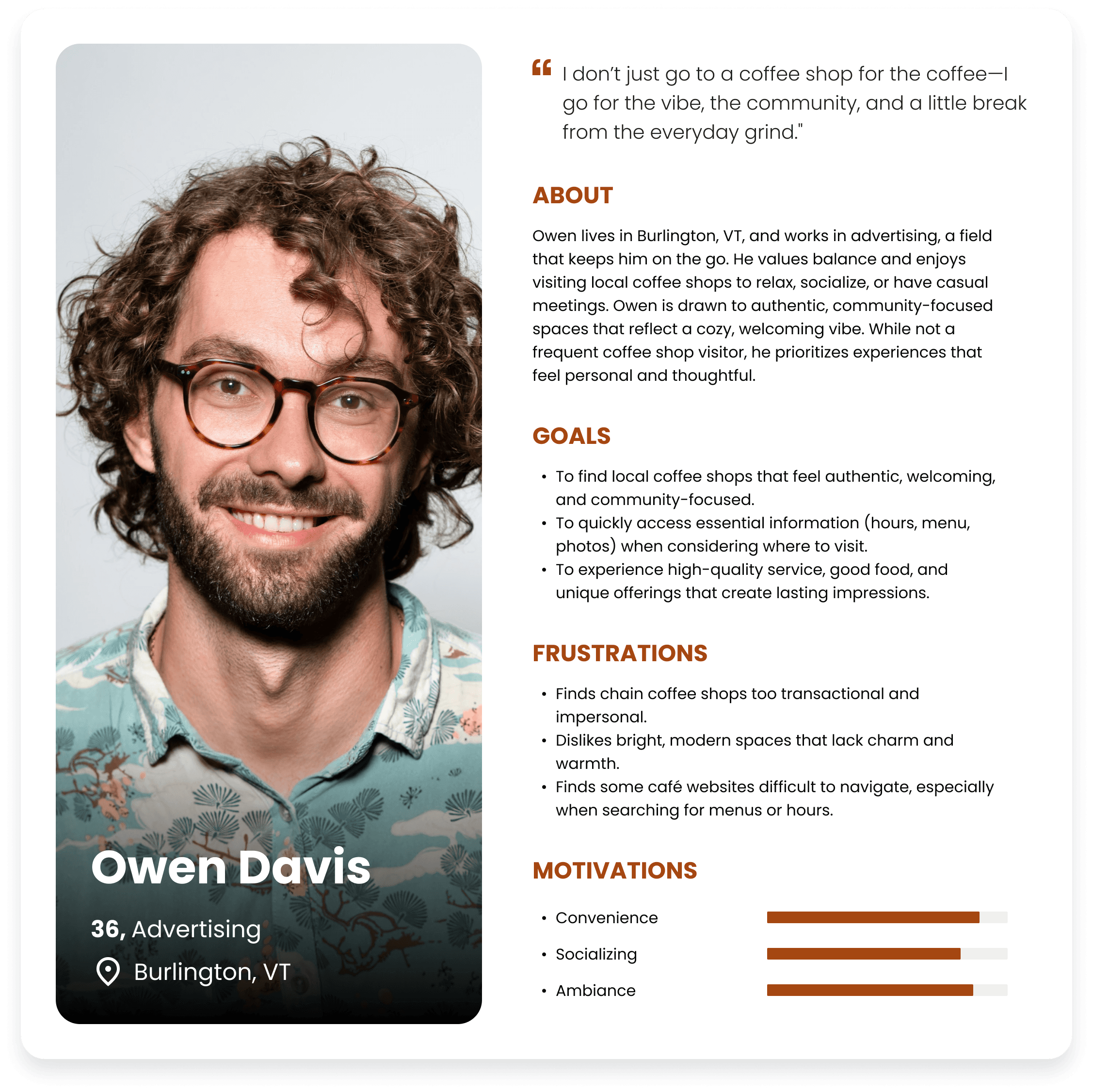
To make my research findings more tangible, I created a user persona which provided a holistic view of the target user that will shape my design decisions.

Understanding Our User: Meet Owen!

Owen needs a local coffee shop that is welcoming, community-focused, and offers easy access to essential information online.

HOW MIGHT WE…

Redesign the Last Cup Cafe website to make key information easier to find and create a seamless digital experience that reflects the café's inviting atmosphere?

IDEATION

Merging Business Goals and User Insights to Drive Feature Design

The key takeaway from user research is that stakeholders prioritize simplicity, community, and efficiency, while users seek easy access to key information and a welcoming atmosphere.

With these insights in mind, the main goal of the website redesign is to make key information more accessible and create a seamless digital experience that reflects the café's inviting atmosphere.

Feature Roadmap

To define and prioritize the core functionalities of the website, along with other essential site pages, I created a feature roadmap. The following features were identified as most essential to fulfilling both business goals and user needs:

  • Homepage

  • About Us

  • Menu

  • Reviews

  • Social Media Integration

  • FAQ

  • Gallery

  • Newsletter Sign-Up

  • Location Map & Hours

  • Loyalty Program

  • Gift Card

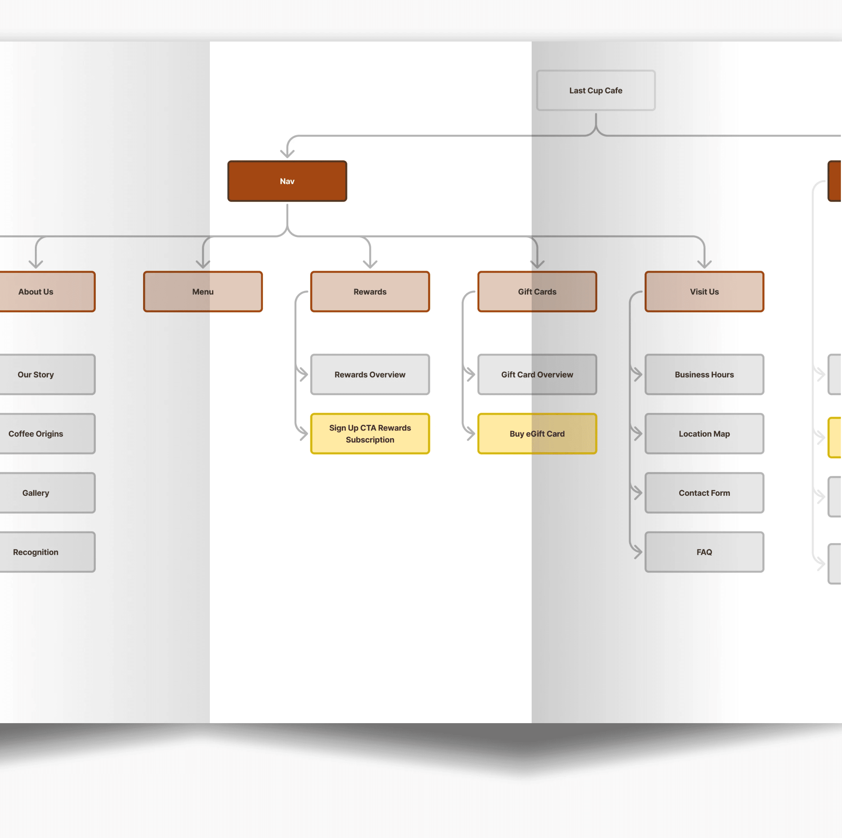
Translating Features into a Site Map

With the core features defined, I translated them into a site map to ensure a clear and intuitive structure. The map organizes pages in a logical flow, making key information easy to find and reflecting the café’s welcoming atmosphere.

DESIGN

Designing a Seamless and Inviting User Experience

With the site structure defined, I sketched key layouts to ensure clear navigation and an inviting feel. Prioritizing simplicity and usability, I then refined my designs in Figma, focusing on:

  • Clean, accessible layouts for effortless browsing

  • High-quality imagery to capture the café’s warmth

  • Intuitive navigation for quick access to key information

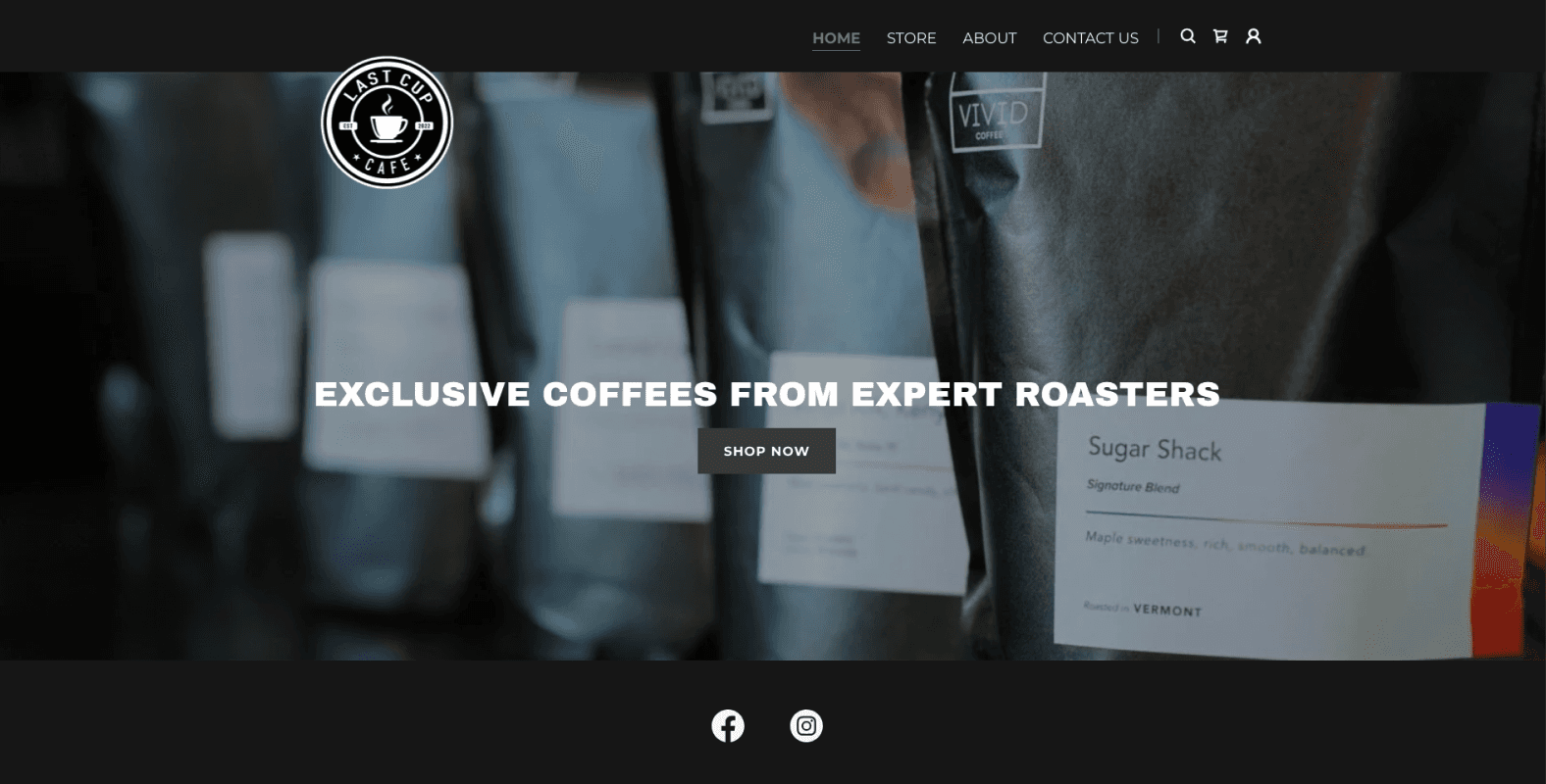
This approach ensured a digital experience that feels as welcoming as the café itself.

Crafting the Visual Design with Limited Content

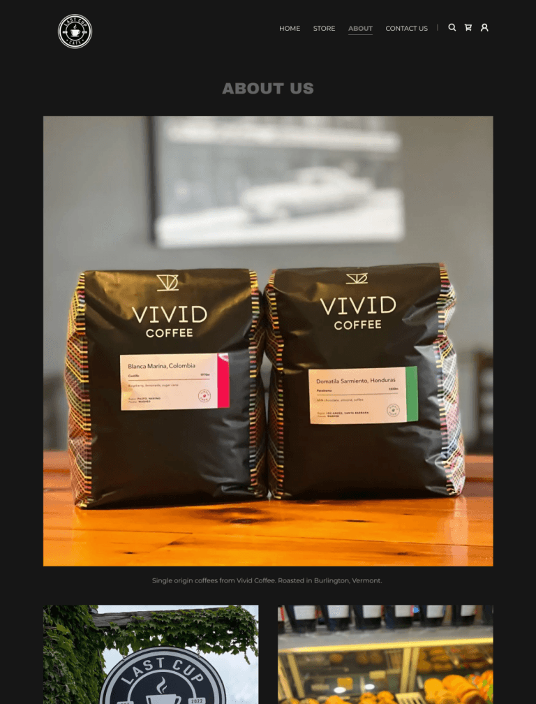
One of my biggest challenges was the limited visual elements provided by the stakeholder. I had to be resourceful—curating stock images that blended seamlessly with the brand.

To reflect user expectations, I focused on:

  • Warm, inviting visuals – Emphasizing comfort and connection

  • A cohesive color palette – Reinforcing a cozy, relaxed feel

  • Readable typography – Ensuring clarity and approachability

Every design choice—from imagery to typography—was selected to capture the café’s welcoming atmosphere while maintaining brand consistency.

TESTING & ITERATIONS

"This Feels Like A Place I Would Want to Visit"

To validate the redesign’s effectiveness, I conducted moderated usability tests and System Usability Scale (SUS) assessments with five participants. The goal: evaluate how easily users could navigate the site, complete key tasks, and overall satisfaction.

Participants were asked to:

  • Navigate to the About Us page to learn more about the business

  • Navigate to the Menu page and locate bagels in the Baked Goods section

  • Navigate to the Visit Us page to determine store hours and location

All five participants successfully completed the tasks and praised the overall redesign. They noted improvements in clarity and ease of navigation, with several highlighting how the website better conveyed the café's atmosphere.

But even with positive feedback, there were still opportunities for improvement:

RESULTS

Usability soared — the SUS score leaped from 63.5 to 97.5, making the new design significantly more user-friendly

The new design achieved an impressive 9.8/10 satisfaction rating, with both users and the stakeholder praising its ease of use and intuitive navigation. By creating a more seamless experience, the redesign not only improved user engagement but also reinforced the brand’s welcoming identity—helping the business attract and retain more customers.

"The new website design truly captures the welcoming vibe we’ve worked so hard to create at Last Cup Café."

Chris Sabataso, Owner of Last Cup Cafe
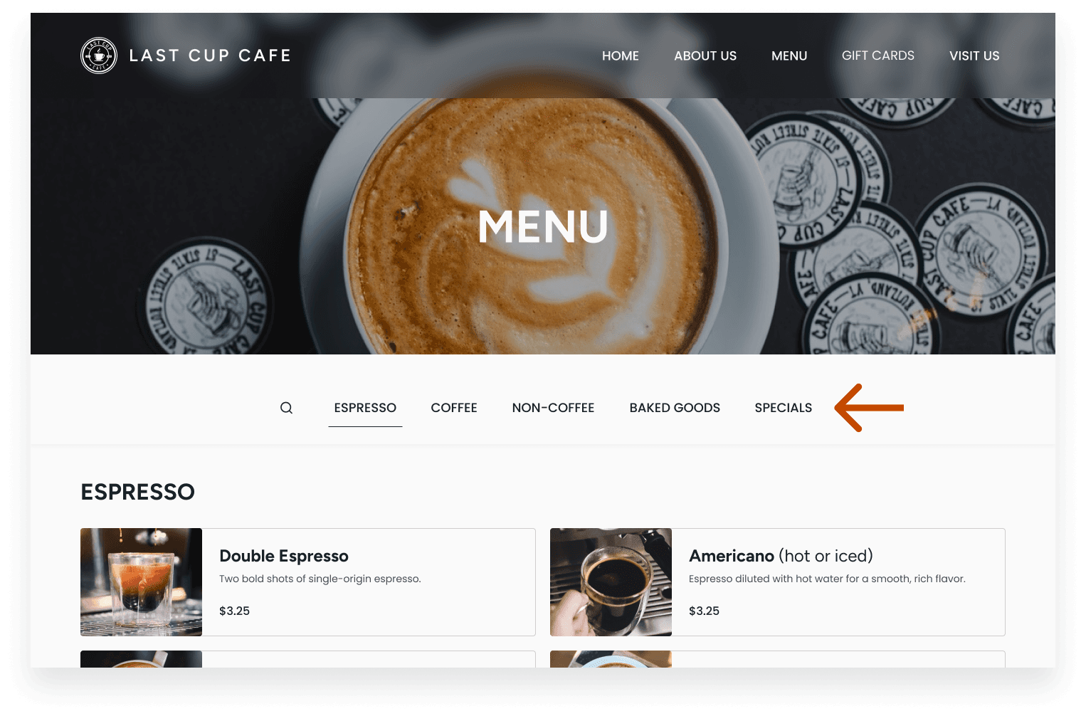
FINAL THOUGHTS

A cluttered, hard-to-navigate website was holding Last Cup Cafe back—my redesign simplified the experience and brought the brand to life.

What I Learned: This project reinforced the importance of aligning user needs with business goals while navigating real-world constraints. Working with Last Cup Café taught me to stay flexible—especially when initial assumptions, like the need for online ordering, didn’t match user or business priorities.

Next Steps: With more time, I’d collaborate with the stakeholder to explore replacing the physical punch card system with a digital loyalty program. This could enhance convenience for customers, increase engagement, and provide valuable business insights. I’d then conduct further usability testing to refine these features based on real-world user feedback.

What I’m Most Proud Of: I’m especially proud of the measurable impact this redesign had. The significant improvement in usability validated the effectiveness of these design decisions. Seeing how thoughtful design solutions not only improved the user experience but also supported the café’s business goals was incredibly rewarding!

LIKE WHAT YOU SEE?

Let's Connect!

mtfredette@gmail.com

2025 Matt Fredette

LIKE WHAT YOU SEE?

Let's Connect!

mtfredette@gmail.com

2025 Matt Fredette

LIKE WHAT YOU SEE?

Let's Connect!

LIKE WHAT YOU SEE?

Let's Connect!

mtfredette@gmail.com

mtfredette@gmail.com

2025 Matt Fredette